
Classic ecological models in Stan: discrete-time logistic growth
In this post, I explore the discrete-time logistic growth model in R (including various animations), and discuss the challenges of fitting the model to data in Stan.
Acknowledgements and other resources
The classic reference here is the paper Simple mathematical models with very complicated dynamics by Robert May.
The model is also mentioned in Chaos by James Gleick, which is a great read.
I learned about Stan and Bayesian stats in general from Richard McElreath’s book and course Statistical Rethinking, Michael Betancourt’s introduction to Stan, and the Stan manual. I also referred to Martin Modrák’s post on identifying non-identifiability when troubleshooting problems with the first model.
I also learned a lot about modeling from the book a biologist’s guide to mathematical modeling in ecology and evolution by Sarah Otto and Troy Day.
Disclaimer
I’m mainly writing this post because a) it’s fun and b) it helps me to learn more about the material - if people find it helpful, then that’s even better!
Please bear in mind that there might be mistakes lurking in this post - if you spot any, I’d appreciate if you let me know via email (my address is in the sidebar) or in the comments below. As usual, use of the model etc. is at your own risk.
Introducing the model
It’s true that I’ve already covered logistic growth in this series - but that was the continuous-time version, and discrete-time logistic growth is much, much more interesting.
The discrete-time logistic growth model appears, unsurprisingly, almost identical to the continuous-time version - the only difference is that rather than looking at how the population changes over an infintessemally small slice of time (i.e., $\frac{dN}{dt}$) we’re looking at how it changes from time-step $t$ to time-step $t+1$
This gives us:
\[N_{[t+1]} = rN_{[t]}\left(1 - \frac{N_{[t]}}{K} \right)\]Where $r$ is the population’s growth rate, and $K$ is the carrying capacity.s
If we set $K = 1$ then we end up with the form used in May’s paper:
\[N_{[t+1]} = rN_{[t]}\left(1 - N_{[t]} \right)\]We’ll use this simpler version throughout this post.
Exploring the model in R
Let’s start off by writing a function for the model:
logistic_growth <- function(r,N0,generations){
  N <- c(N0,numeric(generations-1))
  for(t in 1:(generations-1)) {N[t+1] <- +r*N[t]*(1-(N[t]))}
  return(N)
}
This function takes in values for the population’s growth rate r, the initial population size N0, and the number of generations (i.e., time steps) generations and returns the population size N at each time t.
For instance:
generations <- 50
init <- 0.4
r <- 2
Nt <- logistic_growth(r = r,
                      N0 = init,
                      generations = generations)


plot(1:generations ,Nt, type = "o", pch = 16, ylim = c(0, 1), xlab = "Time", ylab = "N")
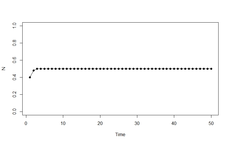
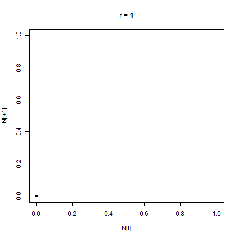
Ok, so this isn’t very interesting - the population rapidly climbs from its initial state to an equilibrium at 0.5, and then stays there.
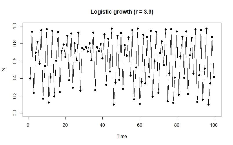
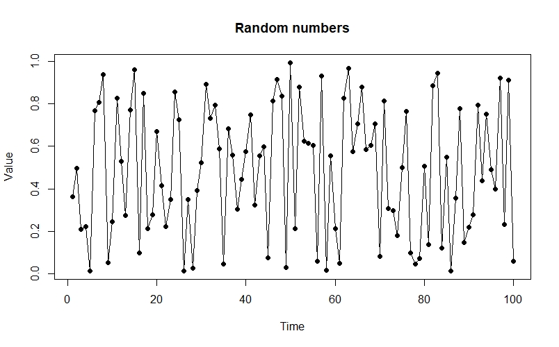
The really interesting stuff starts to happen when we increase the value of $r$ - for example, when $r = 3.9$ our plot starts to look like this:
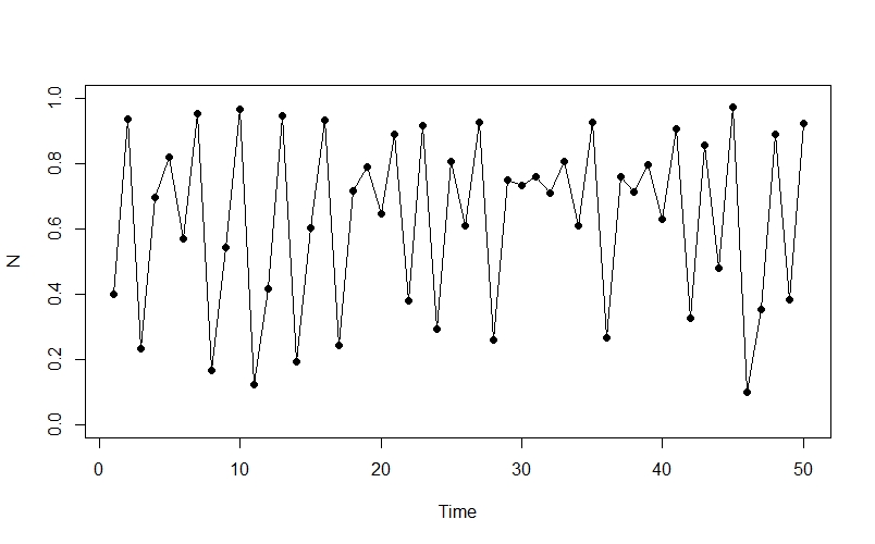
The population appears to be fluctuating chaotically - we can see oscillations as well as more stable periods, and there is no obvious pattern to the changes.
Before we explore the model in more detail, let’s load a few useful packages:
library(rethinking)
library(animation)
library(viridis)
Bifurcation diagram
We already have an idea that the system will become chaotic as we increase $r$, but we want to explore this behaviour in more detail. One way we can do this is to reproduce one of the most iconic graphs in the field of ecology.
The basic idea is that we’re going to iterate over a sequence of values for $r$, and plot the system’s long-term state (here we’re going to use the last 500 time-steps out of 3000) for each value.
# Define sequence of r values, initial state and length of time
rseq <- seq(1, 4, by = 0.0025)
init <- 0.5
generations <- 3000

# Fill matrix with values for last 500 time steps at each value of r
Nt_mat <- matrix(NA, nrow = length(rseq), ncol = 1000)
for(i in 1:length(rseq)){
  Nt <- logistic_growth(r = rseq[i], N0 = init, generations = generations)
  Nt <- Nt[2501:3000]
  Nt_mat[i,] <- Nt
}

# Colour palette
p <- viridis(500, direction = -1)

# Plot the diagram (NB: this can take a few minutes!)
plot(NULL, xlim = c(1,4), ylim = c(0, 1), xlab="r", ylab="N in last 1000 time steps")
for(i in 1:length(rseq)){
  for(j in 1:500){
    points(x = rseq[i], y = Nt_mat[i, j], pch=".", col=col.alpha(p[j], 1))
  }
}
The result is this plot - the bifurcation diagram:
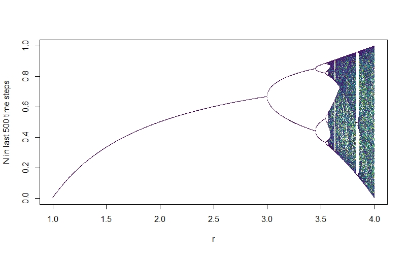
We see that at first, when $r$ is low, the system reaches a final equilibrium value, just as we saw earlier. When r reaches about 3, there is a split - the system no longer reaches a final equilibrium population, but rather oscillates between two values. As we increase $r$, further, there are further bifurcations and the system rapidly descends into chaos.
Looking at the chaotic section of the diagram, we can see that this isn’t just random noise - there is a complex underlying structure here, with brief windows of stability (e.g., the big white vertical band where the system briefly oscillates at period 3). We’re going to be exploring this underlying order in various other ways throughout this post.
To make the animated bifurcation diagram I used as the Twitter thumbnail for this post, you can do the following (note that this can take a while to run - you can make it faster by setting a larger interval e.g. by = 0.01 for rseq, and adjusting interval to a larger number accordingly):
# Define r sequence to simulate over
rseq <- seq(2.75, 4, by = 0.01)
pause <- rep(4, 30) # So that the gif holds on the last frame for a bit
rseq <- c(rseq, pause)
init <- 0.5
generations <- 3000
p <- viridis(1000) # Colour palette

# Fill matrix with time-series for each value of r
Nt_mat <- matrix(NA, nrow = length(rseq), ncol = 1000)
for(i in 1:length(rseq)){
  Nt <- logistic_growth(r = rseq[i], N0 = init, generations = generations)
  Nt <- Nt[2001:3000]
  Nt_mat[i,] <- Nt
}

# Save gif to working directory (with black background)
saveGIF(expr = for(i in 1:length(rseq)){
  par(bg="black",
      oma=rep(0.1, 4),
      mai=rep(0.1, 4)
  )
  plot(NULL, xlim = c(2.75,4), ylim = c(0, 1), xaxt="n", yaxt="n", xlab="", ylab="")
  for(j in 1:1000){
    points(x = rseq[1:i], y = Nt_mat[1:i, j], pch=".", col=col.alpha(p[j], 1))
  }
},
        movie.name = "bifurcation.gif",
        img.name = "Rplot",
        interval = 0.1
)

Poincaré plots
If you were just to see the the chaotic time series produced as $r$ gets larger, you could easily mistake it for a series of random values. For instance:
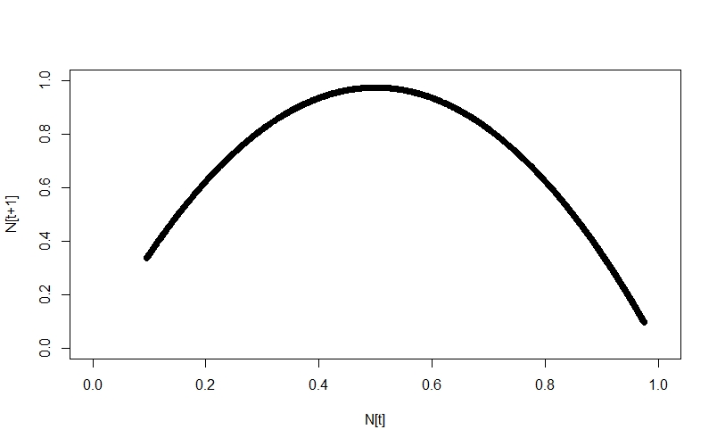
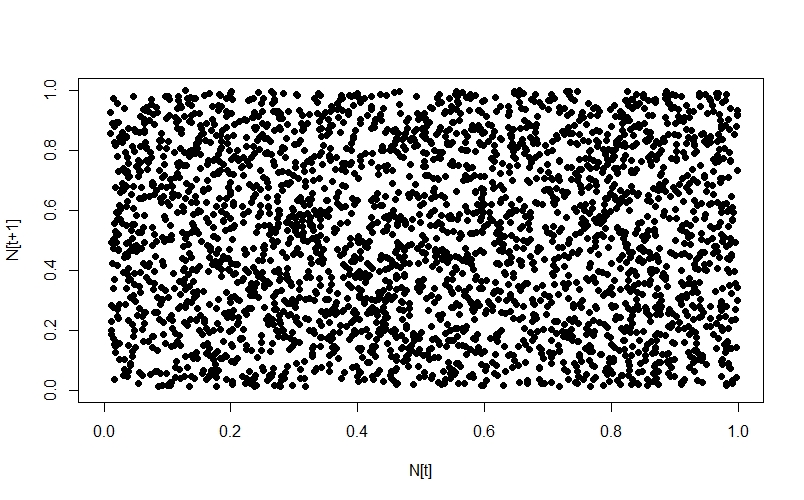
From this perspective, the distance between the two is not hugely apparent - but by adopting a different perspective, the difference can immediately become clear. One such perspective is provided by the Poincaré plot, in which we plot each time step $N_{[t]}$ against the next step, $N_{[t+1]}$. When we look at a time-series like this, a stable equilibrium looks like a single point, an oscillation between two values looks like two points, etc.
We’re going to use a function (which I borrowed from here) to shift a copy of the time-series one place to the right, and then plot it against the original:
# Logistic growth
Nt <- logistic_growth(r=3.9,
                        N0=0.5,
                        generations=3000)
# Random numbers
rseries <- runif(3000, 0.01, 1)

# Shift function
shift <- function(x, lag) {
  n <- length(x)
  xnew <- rep(NA, n)
  if (lag < 0) {
    xnew[1:(n-abs(lag))] <- x[(abs(lag)+1):n]
  } else if (lag > 0) {
    xnew[(lag+1):n] <- x[1:(n-lag)]
  } else {
    xnew <- x
  }
  return(xnew)
}

# Shift time series to get plus1 values
Nt_plus1 <- shift(Nt, -1)
rseries_plus1 <- shift(rseries, -1)

# Plots
plot(Nt_plus1 ~ Nt, pch=16, xlim = c(0,1), ylim=c(0,1), xlab="N[t]", ylab="N[t+1]")
plot(rseries_plus1 ~ rseries, pch=16, xlim = c(0,1), ylim=c(0,1), xlab="N[t]", ylab="N[t+1]")
Looking at the systems in this way, the difference is immediately apparent. The logistic growth system traces a nice, neat curve:
whereas the random numbers just show up as noise:
Since we’re in the mood for animating things today, we’re going to animate how the Poincaré plot changes as $r$ changes:
saveGIF(expr = for(i in 1:length(rseq)){
  Nt <- logistic_growth(r = rseq[i], N0 = 0.5, generations = 5000)
  Nt_sub <- Nt[4000:5000]
  Nt_plus1 <- shift(Nt_sub, -1)
  plot(Nt_plus1 ~ Nt_sub, xlim=0:1, ylim=0:1, xlab="N[t]", ylab="N[t+1]", pch=16, main=paste("r =",rseq[i]))
},
  movie.name = "logistic_poincare.gif",
  img.name = "Rplot",
  interval = 0.1
)
This provides us with another angle on the bifurcation diagram - we can see the initial equlibrium as a single point which moves diagonally up and right as the equilibrium population size increases, then the series of bifurcations, and then the arc as chaos appears.
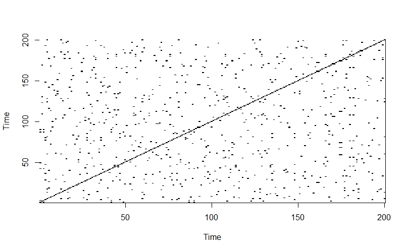
Recurrence plots
Another way of exploring the hidden structure of the logistic growth system is by using recurrence plots. The basic idea is for each point in time, we look at the rest of the time series and see which other times have similar values of $N$. The code looks like this:
# Simulate logistic growth
generations <- 3000
init <- 0.5
r <- 3.9
Nt <- logistic_growth(r = r,
                      N0 = init,
                      generations = generations)
Nt <- Nt[2901:3000]

# Create matrix to hold recurrence data
recurrence_mat <- matrix(NA, nrow=length(Nt), ncol=length(Nt))

dist_tolerance <- 0.01 # How similar N has to be to be classed as the same

# Fill matrix - 1 if similar, 0 if not
for(i in 1:length(Nt)){
  for(j in 1:length(Nt))
    if(abs(Nt[i] - Nt[j]) < dist_tolerance){
      recurrence_mat[i,j] <- 1
    } else {
      recurrence_mat[i,j] <- 0
    }
}

# Visualise
image(1:ncol(recurrence_mat), 1:nrow(recurrence_mat), t(recurrence_mat),
      col = c("white", "black"),
      axes = TRUE,
      xlab = "Time",
      ylab = "Time")
We can also do an animated version which cycles through all the values of $r$:
# Define r sequence and array to hold values
rseq <- seq(3, 4, by = 0.01)
recurrence_array <- array(NA, dim=c(200, 200, length(rseq)))

# Fill array
for(k in 1:length(rseq)){
  Nt <- logistic_growth(r = rseq[k], N0 = 0.5, generations = 3000)
  Nt <- Nt[2801:3000]
  for(i in 1:length(Nt)){
    for(j in 1:length(Nt))
      if(abs(Nt[i] - Nt[j]) < dist_tolerance){
        recurrence_array[i,j,k] <- 1
      } else {
        recurrence_array[i,j,k] <- 0
      }
  }
}

# Save gif to working directory
saveGIF(expr = for(i in 1:length(rseq)){
  image(1:ncol(recurrence_array[,,i]), 1:nrow(recurrence_array[,,i]), t(recurrence_array[,,i]),
        col = c("white", "black"),
        axes = TRUE,
        xlab = "Time",
        ylab = "Time",
        main = paste("r=",rseq[i]))
},
movie.name = "recurrence.gif",
img.name = "Rplot",
interval = 0.2
)
The plot starts out with a checkerboard pattern as the system is still oscillating between two points (meaning that every 2nd time will be the same) - we then see a variety of interesting structures appear as the system descends into chaos. Later on we briefly see other checkerboards for the period-3 oscillation windows which we can see in the bifurcation diagram, then more chaos again.
In comparison, when we apply the same method to a completely random time-series, the off-diagonals of the plot just look like noise:
randseries <- runif(length(Nt), 0.01, 1)
randmat <- matrix(NA, nrow=length(Nt), ncol=length(Nt))

for(i in 1:length(randseries)){
  for(j in 1:length(randseries))
    if(abs(randseries[i] - randseries[j]) < dist_tolerance){
      randmat[i,j] <- 1
    } else {
      randmat[i,j] <- 0
    }
}
image(1:ncol(randmat), 1:nrow(randmat), t(randmat),
      col = c("white", "black"),
      axes = TRUE,
      xlab = "Time",
      ylab = "Time")
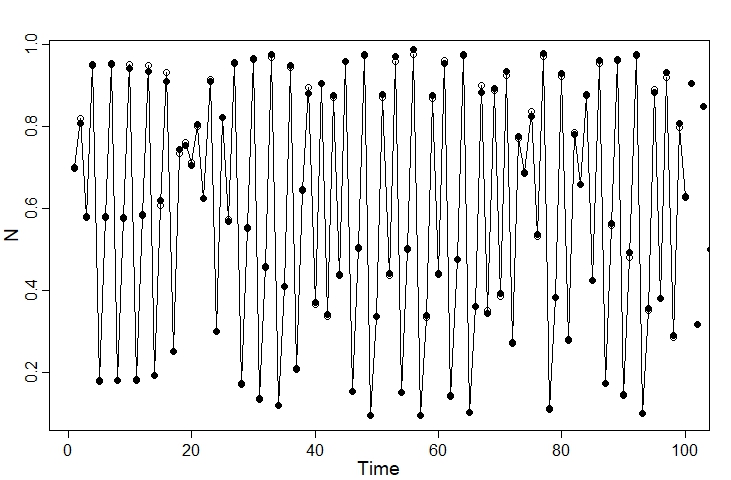
Simulating the observed data
Now that we’ve explored some of the amazing features of the logistic growth model, we’re nearly ready to fit the model to data using Stan - but first, we have to simulate some data! We can do this using the following code:
generations <- 10000
init <- 0.7
r <- 3.9
N_true <- logistic_growth(r = r,
                          N0 = init,
                          generations = generations)

N_obs <- rlnorm(length(N_true), log(N_true), 0.01), 0.05)
Plotting the actual versus observed values for the first 100 time steps, we can see that the two are closely-matched:
plot(1:100, N_true[1:100], type="o", pch=1, xlab = "Time", ylab = "N")
points(N_obs, pch=16)
We can then put the data into a list for Stan:
dlist <- list(
  n_times = as.integer(generations),
  y = N_obs
)
How NOT to fit the model in Stan
My first idea was to try to adapt the code for the continuous-time logistic growth model, which leads to something like this:
functions{
  vector logistic_growth(int times,
                         real y,
                         real r){
    vector[times] n;

    n[1] = y;

    for(t in 1:(times-1)){
      n[t+1] = n[t] + n[t] * r * (1 - n[t]);
    }
    return n;
  }
}
data{
  int<lower=0> n_times; // Number of time steps
  array[n_times] real<lower=0> y; // Observed data after initial state
  real<lower=0> y0_obs; // Observed data at initial state
}
parameters{
  real<lower=0> r; // Per-capita rate of population growth
  real<lower=0> y0; // Initial condition
  real<lower=0> sigma; // Standard deviation for observation model
}
transformed parameters{
  vector[n_times] mu;

  // Difference equation
  mu = logistic_growth(n_times, y0, r);
}
model{
  // Priors
  r ~ uniform(1, 3);
  y0 ~ beta(4,4);
  sigma ~ exponential(3);

  // Observation model
  y0_obs ~ lognormal(log(y0), sigma);
  y ~ lognormal(log(mu), sigma);
}

  y ~ lognormal(log(mu), sigma);
}
As I soon found out, this is not a good idea.
When we run the model, we are warned of divergent transitions and transitions hitting the treedepth limit:

Checking the model diagnostics using the dashboard function, we see that things are not looking great. In particular, we’re seeing a very poor R-hat and number of effective samples for several parameters:
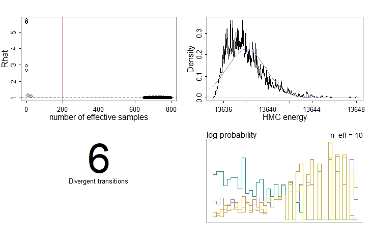
If we look at the model summary table using the precis command, we can see that one of these parameters is the initial condition, y0.
Heading over to the model’s traceplots, things are also looking bad. The chains for the initial condition, y0, each ended up in different modes. We know (since we simulated the data) that none of these modes is at the correct value (which is 0.7). The chains for r, on the other hand, have converged - but again at the wrong value!
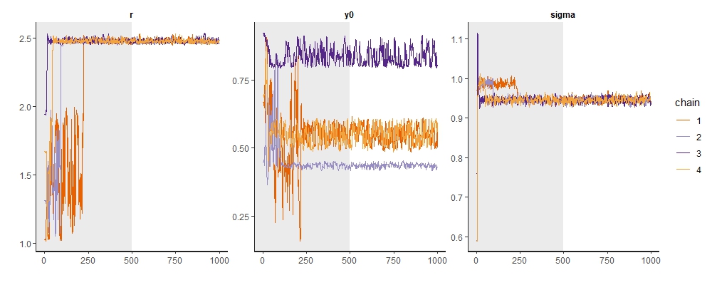
Examining the pairs plot for these parameters along with the log-posterior (lp__) gives us an alternative view:
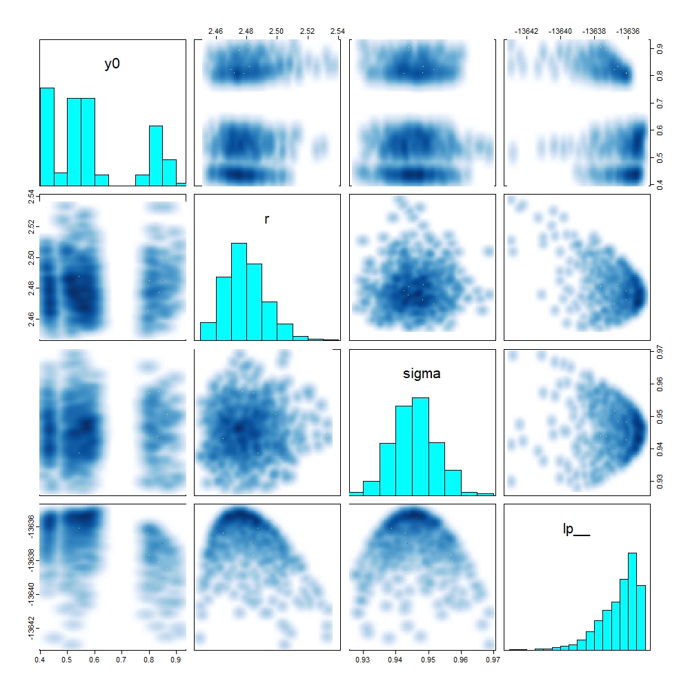
We can again see the multiple modes for y0, and that these all sit at similar values for lp___.
Changing perspective: a better way to fit the model
I spent a long time debugging the previous model, but without success. Perusing the Stan forums, it seemed to me that fitting a model to a chaotic system like this one was unlikely to work.
However, the model exploration we conducted earlier in this post suggests a better way forward: we fit a model to the Poincaré plot.
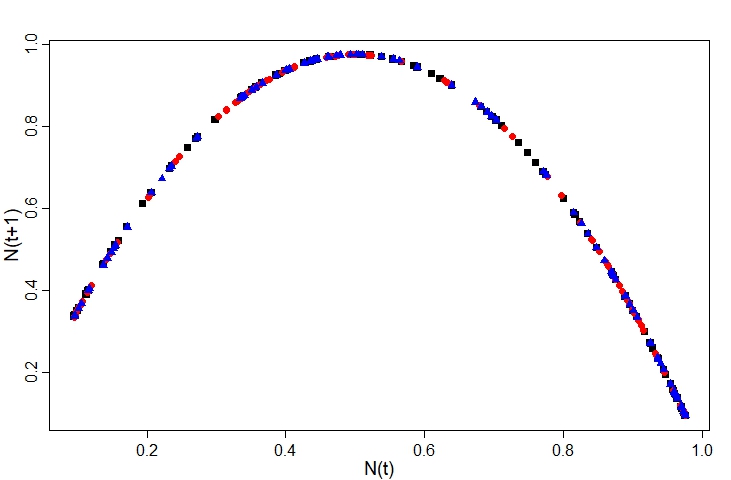
This completely sidesteps the issue of estimating the initial condition y0, because the shape of the Poincaré plot does not depend on the initial conditions. We can see this if we overlay the plots for different initial values (here I’ve gone for 0.1, 0.5, and 0.9) - the points all fall along the same curve:
The equation for this curve is just the logistic model:
\[N[t+1] = rN[t](1-N[t])\]i.e.,
\[y = rx(1-x)\]This is the model we’re going to fit to our data.
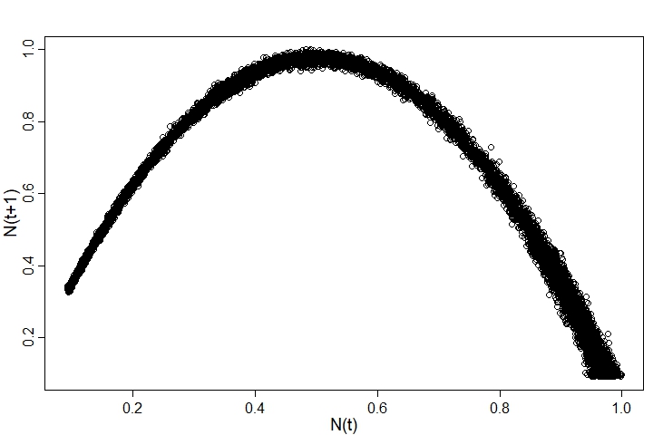
Plotting the observed data, we can see the points fall around the curve:
For simplicity, I’m going to assume the distance from each point to the curve follows a normal distribution. There are certainly better options here, but it’ll do for now.
The Stan code to fit the model looks like:
data{
  int<lower=0> N; // Number of observations (i.e., time steps)
  array[N] real<lower=0> x; // N(t) observed
  array[N] real<lower=0> y; // N(t+1) observed
}
parameters{
  real<lower=0> r; // Per-capita rate of population growth
  real<lower=0> sigma; // Standard deviation for observation model
}
model{
  vector[N] mu;

  // Priors
  r ~ uniform(3.5, 3.99);
  sigma ~ exponential(4);

  // Likelihood
  for(i in 1:N){
    mu[i] = r*x[i]*(1-x[i]);
  }
  y ~ normal(mu, sigma);
}
We can fit the model using the cstan function in the rethinking package:
# Need to discard final observation to avoid having an NA value
dlist <- list(N = length(N_obs) - 1L,
              x = N_obs[-length(N_obs)],
              y = N_obs_plus1[-length(N_obs_plus1)])

m1 <- cstan(file = "C:/Stan_code/poincare_model.stan",
            data = dlist,
            chains = 4,
            cores = 4,
            warmup = 1500,
            iter = 2500)
Looking at the precis output and traceplots (not shown) we can see that the model appears to have sampled well, although the number of effective samples n_eff for sigma is a fair bit lower:

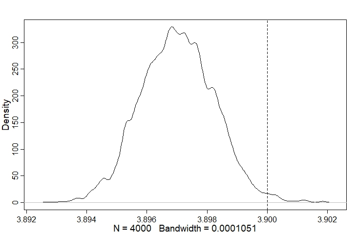
Looking at the posterior distribution for r, we can see it is very close to the true value:
post <- extract.samples(m1)
dens(post$r); abline(v=r, lty=2)
We can also plot the model’s posterior predictions (as median and compatability intervals) using the following code:
#Define sequence of x values
x_seq <- seq(min(N_obs),max(N_obs),0.01)

# Posterior distribution of mean
r_link <- matrix(NA, nrow = length(x_seq), ncol = length(post$r))
for(i in 1:length(x_seq)){
  for(j in 1:length(post$r)){
    r_link[i,j] = post$r[j]*x_seq[i]*(1-x_seq[i])
  }
}
# Show posterior median on plot
mu <- apply(r_link,1,median)

# Simulate distribution of observed values using sigma
r_sim <- matrix(NA, nrow = length(x_seq), ncol = length(post$r))
for(i in 1:length(x_seq)){
  for(j in 1:length(post$r)){
    r_sim[i,j] = rnorm(1, r_link[i,j], post$sigma[j])
  }
}
sim_mu99CI <- apply(r_sim,1,HPDI,prob=0.99)
sim_mu95CI <- apply(r_sim,1,HPDI,prob=0.95)
sim_mu89CI <- apply(r_sim,1,HPDI,prob=0.89)
sim_mu80CI <- apply(r_sim,1,HPDI,prob=0.80)
sim_mu70CI <- apply(r_sim,1,HPDI,prob=0.70)

# Make the plot
plot(NULL, xlim = c(0, 1.1), ylim = c(0, 1.1), xlab="N(t)", ylab="N(t+1)")
lines(x_seq, mu, lwd=2)
shade(sim_mu99CI, x_seq)
shade(sim_mu95CI, x_seq)
shade(sim_mu89CI, x_seq)
shade(sim_mu80CI, x_seq)
shade(sim_mu70CI, x_seq)
# Plot subset of the real data to assess fit
points(N_obs_plus1[2000:2500] ~ N_obs[2000:2500], pch=1)
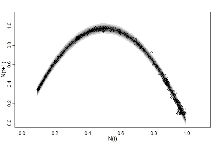
We can see that the model generally fits the observed data quite well - although on right hand side the observed data are more dispersed than the model predicts, while on the left the opposite is true. This suggests that our observation model could be improved.
Although it’s certainly a vast improvement on the first attempt, this model is by no means perfect. For one thing, it ignores the fact that the $x$ variable, $N(t)$, is measured with error - I suspect this is why the model tends to underestimate r when sigma is high. There are probably much better options than a normal distribution with a static sigma value for the $y$ observation model - in our posterior predictive check we can see that the points are more highly spread on the right than the left. I suspect that this is why the model struggled slightly to estimate sigma (as evidenced by the lower n_eff value). I also suspect (although have not tested) that the model will perform poorly if $N$ is either stable or orscillating between two or three states, since then we’ll be fitting a curve to just a few clusters of data points.
However, despite the model’s imperfections I still see it as an instructive example which illustrates how it can be useful to view a problem from a different perspective.
Comments